Kinetic Art Experience 2025
Rebranding
Rebranding
Since 2013, the International Kinetic Art Experience has transformed movement into art, filling the streets of Boynton Beach with interactive sculptures, optical illusions, and immersive installations. To honor its legacy while embracing the future, the city sought to refine its visual identity—one that enhances its iconic “butterfly paperclip” K logo, a symbol of interconnected creativity and motion.
The festival’s branding lacked cohesion. Clashing colors, inconsistent typography, and fragmented visuals diluted its impact. It needed a bold yet refined identity, something modern and versatile that could evolve with the event while remaining instantly recognizable.
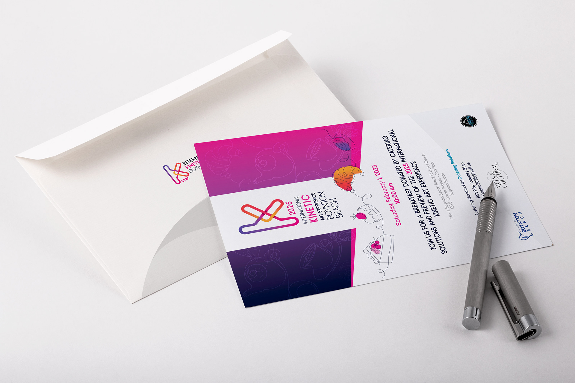
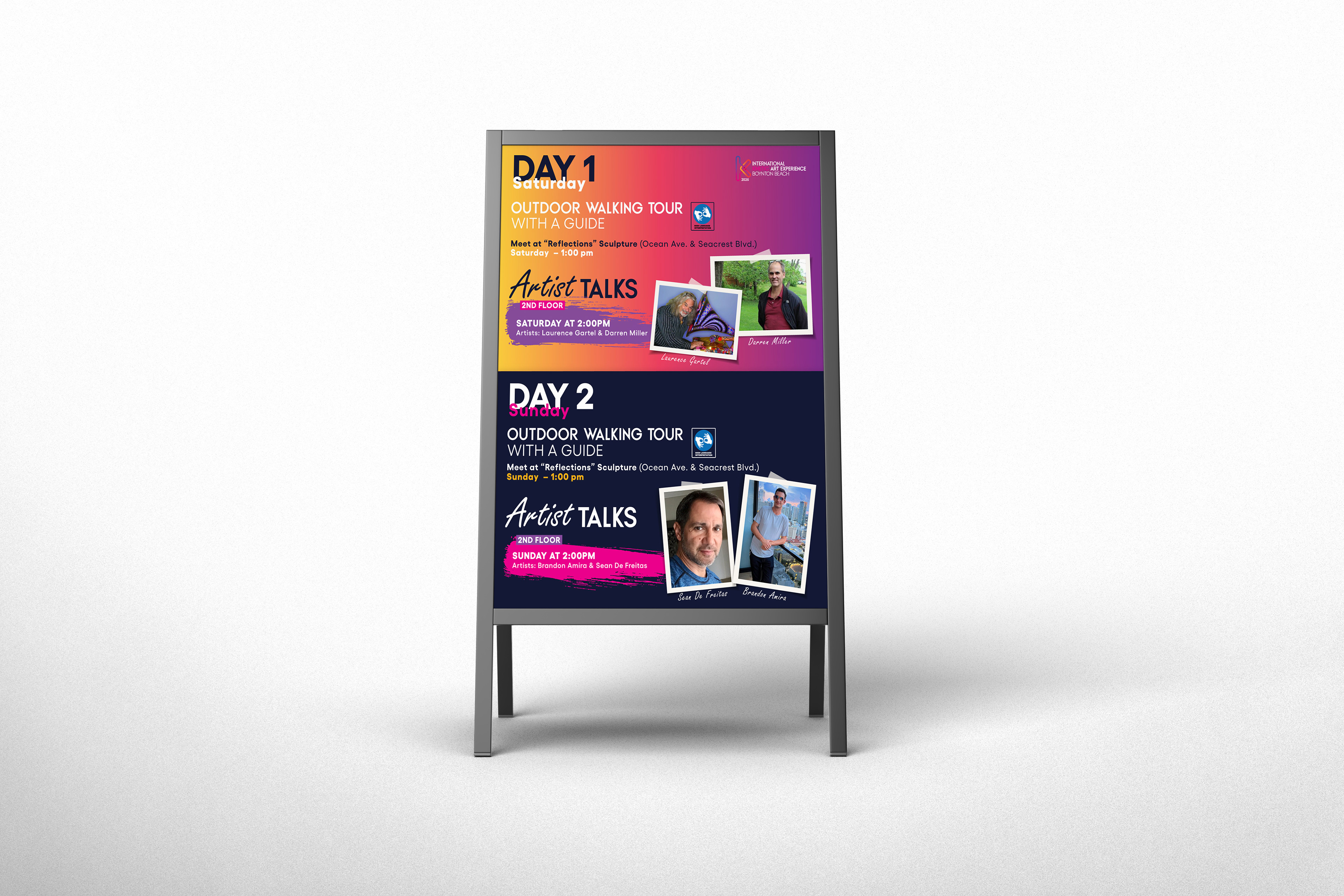
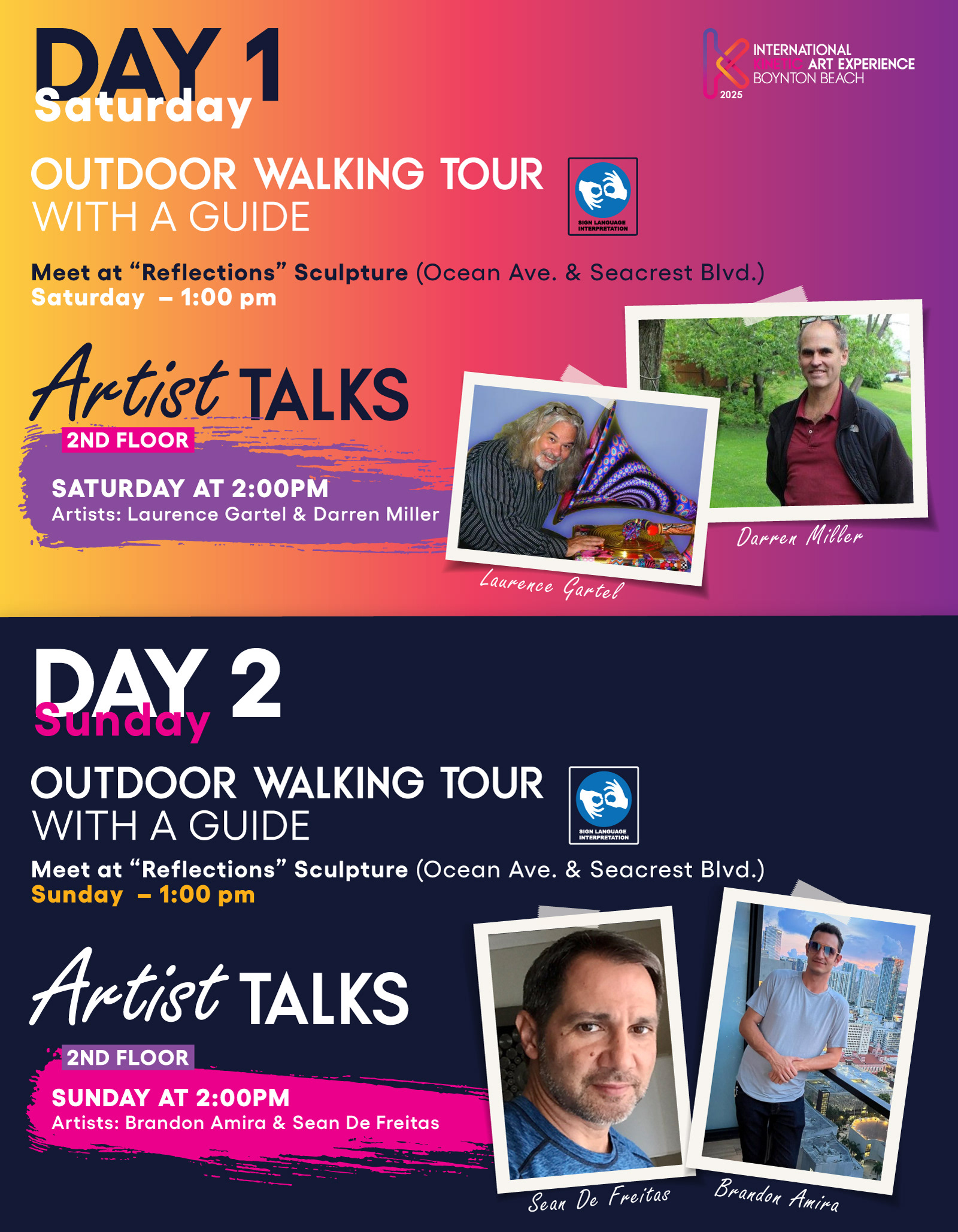
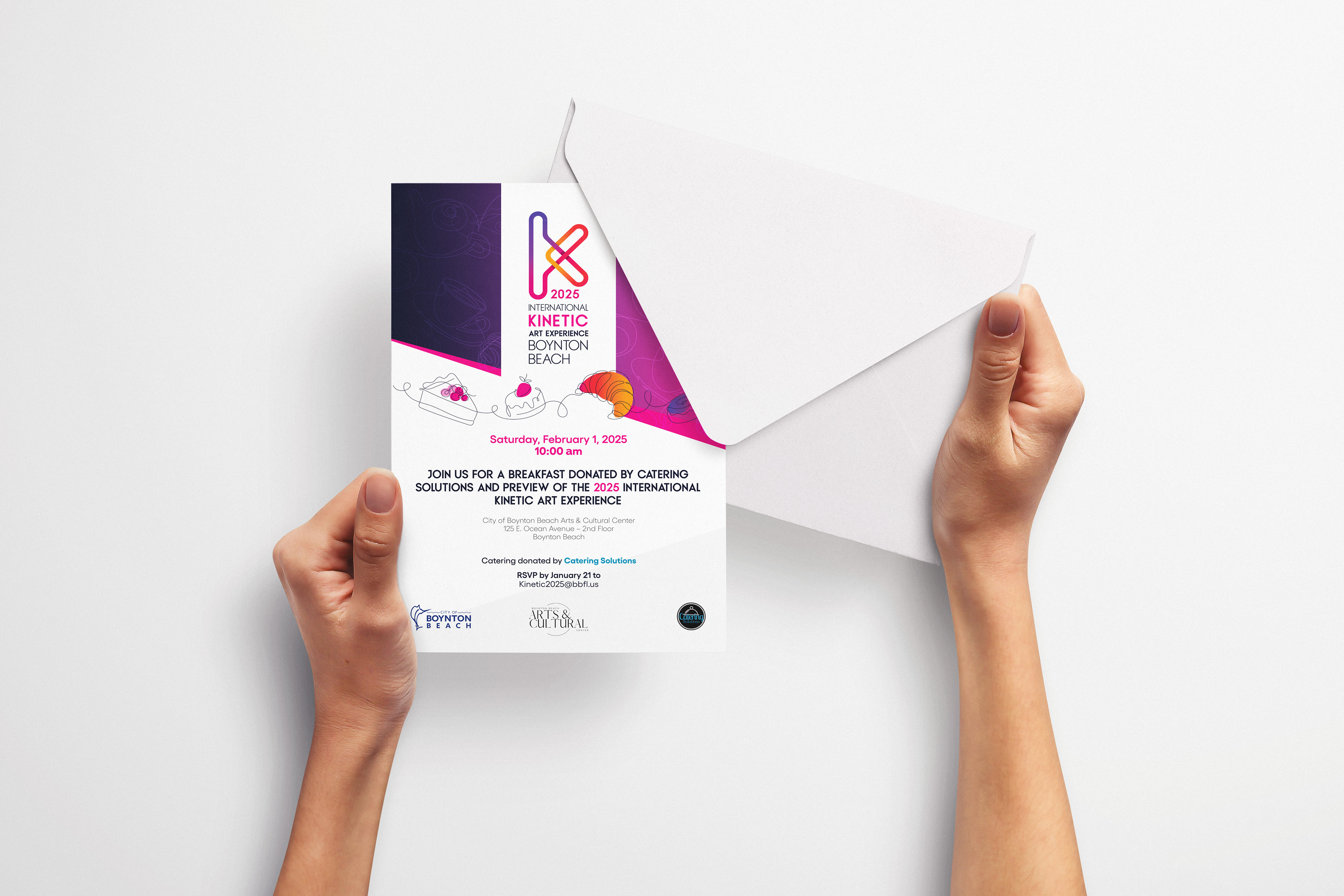
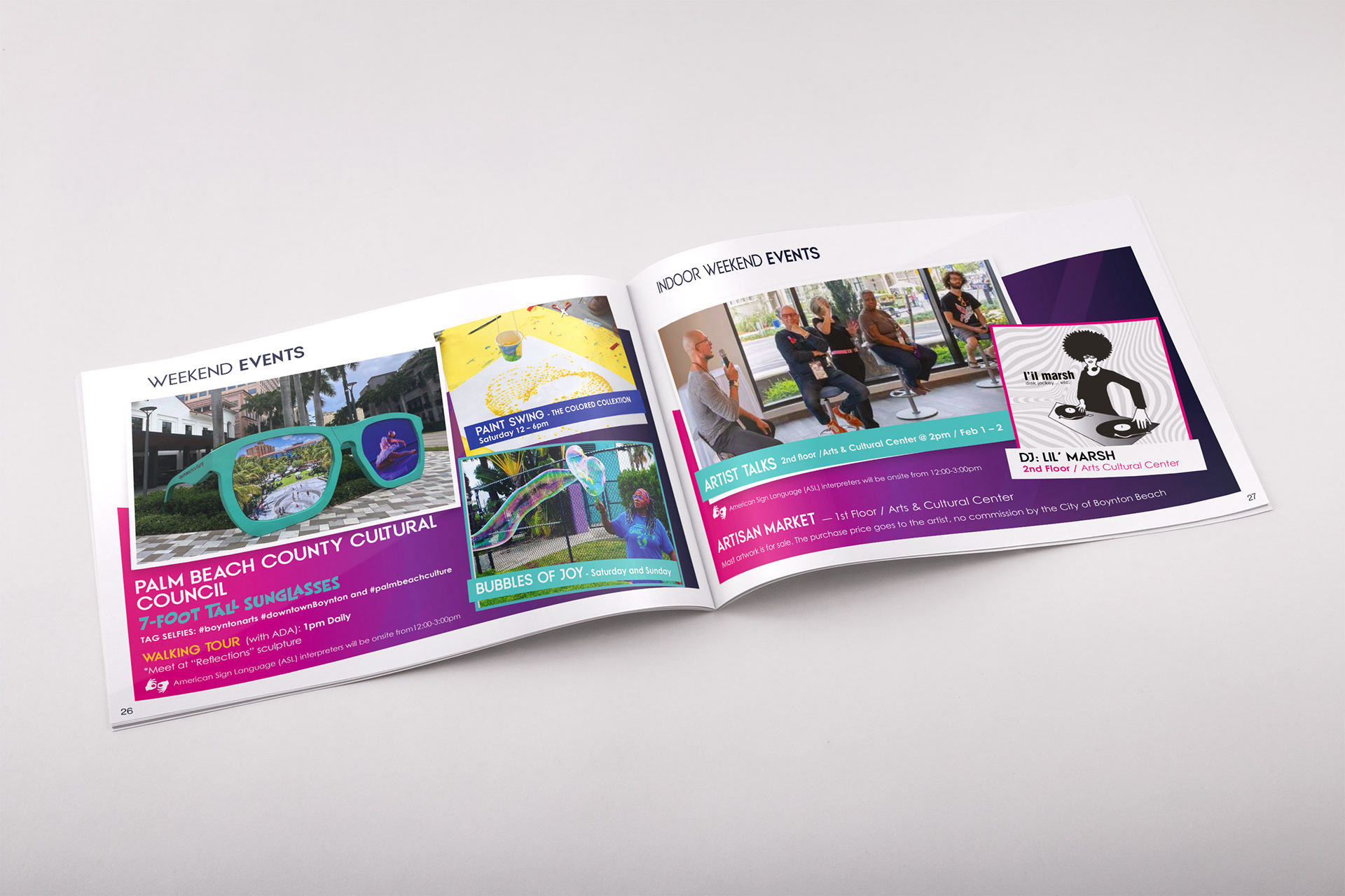
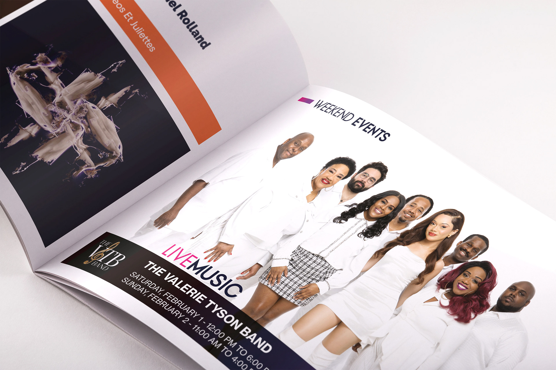
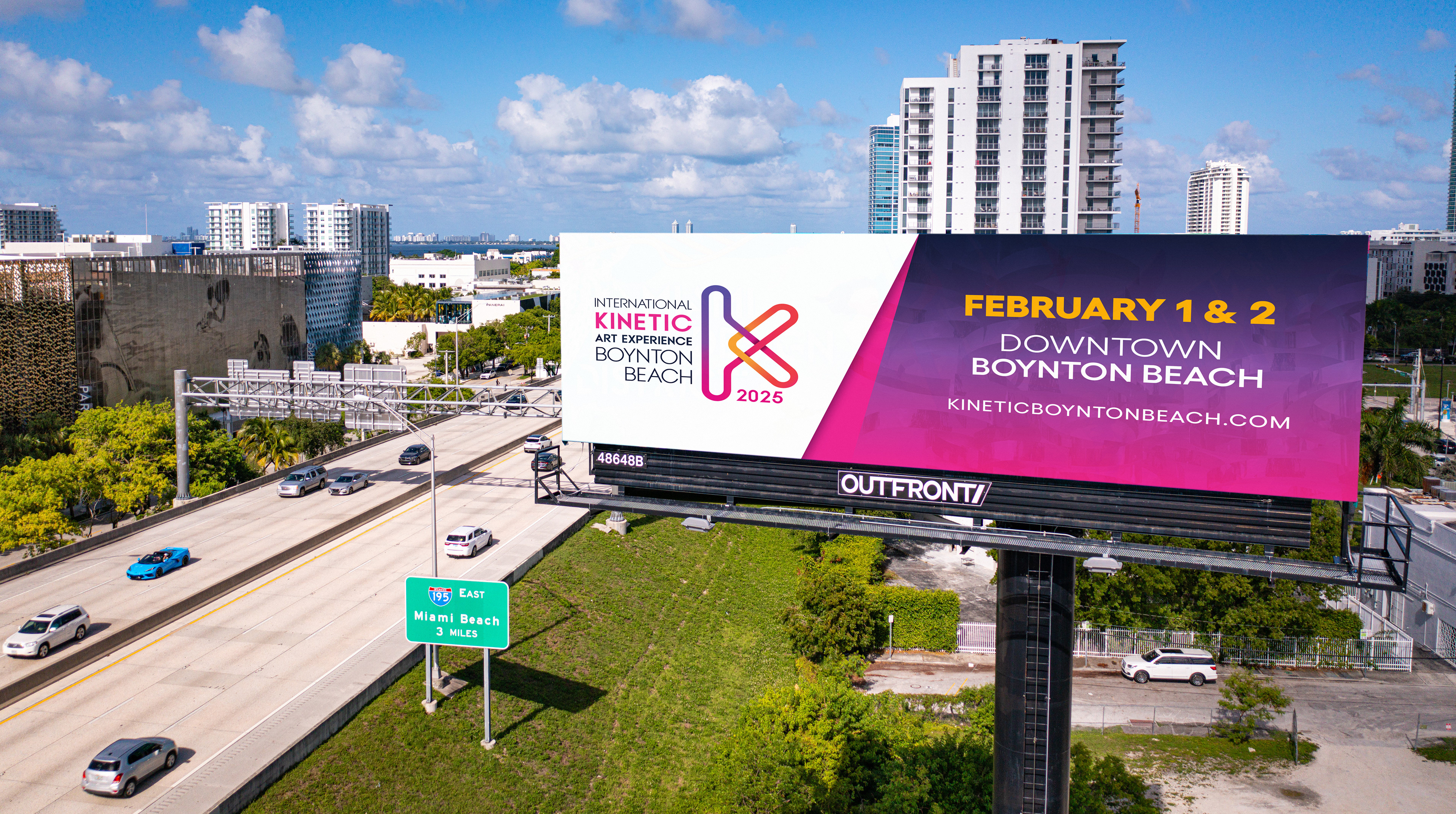
The rebrand brings clarity and sophistication. The "K" logo was refined, balancing symmetry and fluidity to create a cleaner, more contemporary mark. Typography was elevated to ensure clarity and elegance across every touch point. A modular logo system was developed, seamlessly adapting to digital, print, and large-scale installations. The color palette was refreshed, preserving vibrancy while introducing a more nuanced, sophisticated balance.
The result is a brand that moves with the art it represents—seamless, dynamic, and unmistakably Kinetic. The new identity strengthens Boynton Beach’s position as a leading destination for interactive art, ensuring the festival’s presence is as bold and fluid as the work it celebrates.
Concept
This logo is a fusion of movement and structure, embodying the essence of kinetic art. The paperclip, a symbol of connection and adaptability, merges with the letter K, representing kinetic energy and dynamic form. The result is a streamlined, modern mark that captures both fluidity and precision—key elements of the festival’s identity. The continuous form reflects motion, while the bold structure ensures clarity and impact across all applications.
This logo is a fusion of movement and structure, embodying the essence of kinetic art. The paperclip, a symbol of connection and adaptability, merges with the letter K, representing kinetic energy and dynamic form. The result is a streamlined, modern mark that captures both fluidity and precision—key elements of the festival’s identity. The continuous form reflects motion, while the bold structure ensures clarity and impact across all applications.

THANK YOU!
